
Japanese Candlesticks and Time Frames: Identifying Entry Points
Japanese candlesticks are one of the most informative tools for chart analysis. Unlike regular lines, they show not just the direction of price movement, but the actual struggle between buyers and sellers. Understanding the structure of a candlestick and choosing the right time frame form the foundation for confident and profitable trades.
How a Japanese candlestick is structured and what it indicates
A standard line chart displays only closing prices and hides important details. In contrast, a Japanese candlestick fully reveals the price movement over a specific time period. Each candlestick consists of two key elements:
- The candle body is the rectangular portion that shows the range between the opening and closing prices. The width and size of the body are used to gauge the main volume of price movement.
- A shadow (wick or tail) consists of thin lines extending from the top and bottom. These indicate the extreme points (highs and lows) that the price reached before pulling back.
Color Logic and Candlestick Signals
The color and shape of a candlestick provide a quick indication of market sentiment:
- A green candle — the closing price was higher than the opening price (buyers are in control).
- A red candle indicates that the price closed below the opening price (sellers are in control).
- A large body with short shadows indicates a steady, calm trend in one direction in the market.
- A small body with long shadows is a sign of a fierce battle between the "bulls" and the "bears." At times like these, it's best to refrain from entering a trade in the direction of the trend and wait for the market to stabilize.
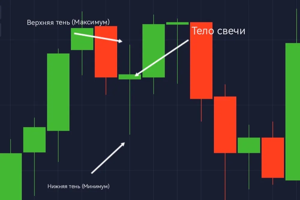 A Japanese candlestick on the chart
 What Is a Time Frame and How Does It Work?
A timeframe is the period of time during which a single candlestick is fully formed. Analyzing multiple timeframes simultaneously allows you to view the market from different angles and see the full picture:
- The higher time frame shows the overall global direction of the trend and where the majority of market participants are heading.
- The lower timeframe reveals the “inner workings” of a single large candle. It shows micro-levels, local support and resistance levels, and precise entry points that are not visible on a larger scale.
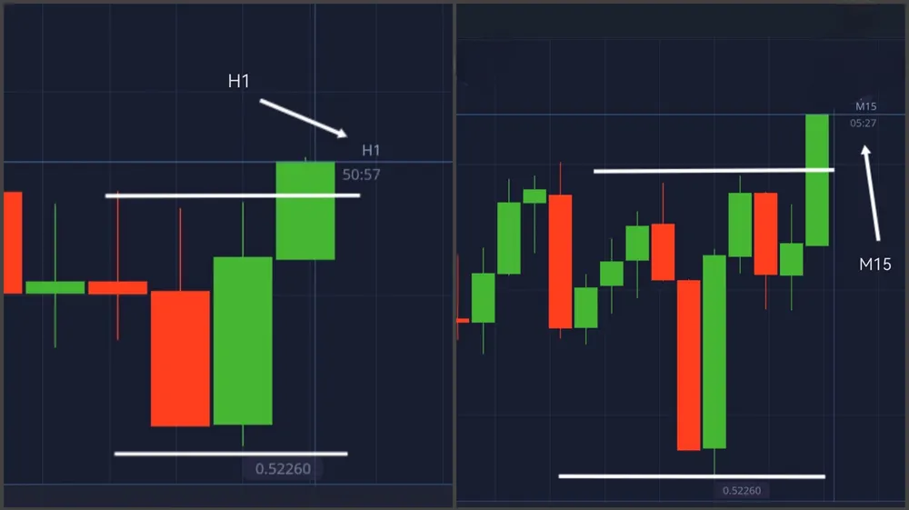 A Schematic Comparison of Two Time-Frame Charts
Decision-Making Algorithm for Candlestick Analysis
- Step 1. Identify the trend. On the higher timeframe, assess the overall direction and make a fundamental decision—whether to buy or sell.
- Step 2. Find an entry point. Switch to a lower timeframe, identify local intermediate levels, and choose the safest moment to enter the trade.
- Step 3. Set the expiration time. Choose a comfortable trade duration (expiration time) based on current market activity and volatility.